


Color serves as a fundamental element in graphic systems, particularly in interface design. Alongside form and typography, it constitutes the core of interface design. In this article, we are exploring how a cohesive structure and mathematical principles can streamline color management for designers and developers operating within a design system.
To get started, we'll outline the key types of color systems necessary for scaling and enhancing flexibility within a design system.


Base Palette
This palette encompasses the full spectrum of utilized colors, categorizing them into various tones that range from the darkest to the lightest. At the base color palette level, you establish a system for calculating these tones, thereby contributing to the overall flexibility of the design system.
Semantic Structure
The semantic palette defines the framework and guidelines for working with colors within the interface. It clarifies the role of color in the interface, making the management of various tones more straightforward. This palette serves as a universal template for creating diverse themes.
Theme
The semantic structure serves as a template or a set of rules for shaping a theme. A theme, in turn, is a template filled with specific values of variables. It's crucial to emphasize the clear distinction between these two concepts, even though theу are inherently interconnected. A theme lacking a predefined set of rules can hinder the development of other themes and limit flexibility, particularly when it comes to custom or partner themes.
Base Color Palette


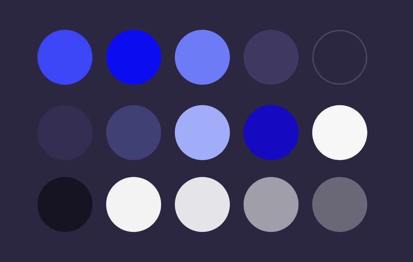
Colors in an interface are remarkably versatile. Although minimalist interfaces may seem to rely on just three colors - light, dark, and accent - a closer examination reveals a rich spectrum of tones. This diverse range of tones serves multiple purposes.
Enhancing Interactivity
This approach enables you to incorporate interactivity and empower users with control over the system. Different tones of the same color can convey the system's response to user actions, such as pointing and clicking.


Managing Hierarchy and Emphasis
Within any interface, elements naturally form a hierarchy. Color, combined with dimensionality, can be used to manage and highlight this hierarchy. For instance, important headlines can appear larger and darker in a light-themed design, while secondary text may be smaller and lighter to downplay its significance.
Ensuring Accessibility
Consider small UI elements as an example - they can benefit from being either lighter or darker to improve readability for users. Smaller elements, in particular, require increased contrast, which makes it necessary to have a variety of lightness tones.
The base palette acts as the primary constraint of the variant space, enabling smooth and systematic selection of tones. For instance, when creating a theme, you can simply utilize the adjacent shade in the palette when determining the hover color for a button (e.g., primary.bg: Marine 400, primary.bgHover: Marine 500).
Creating a Base Palette
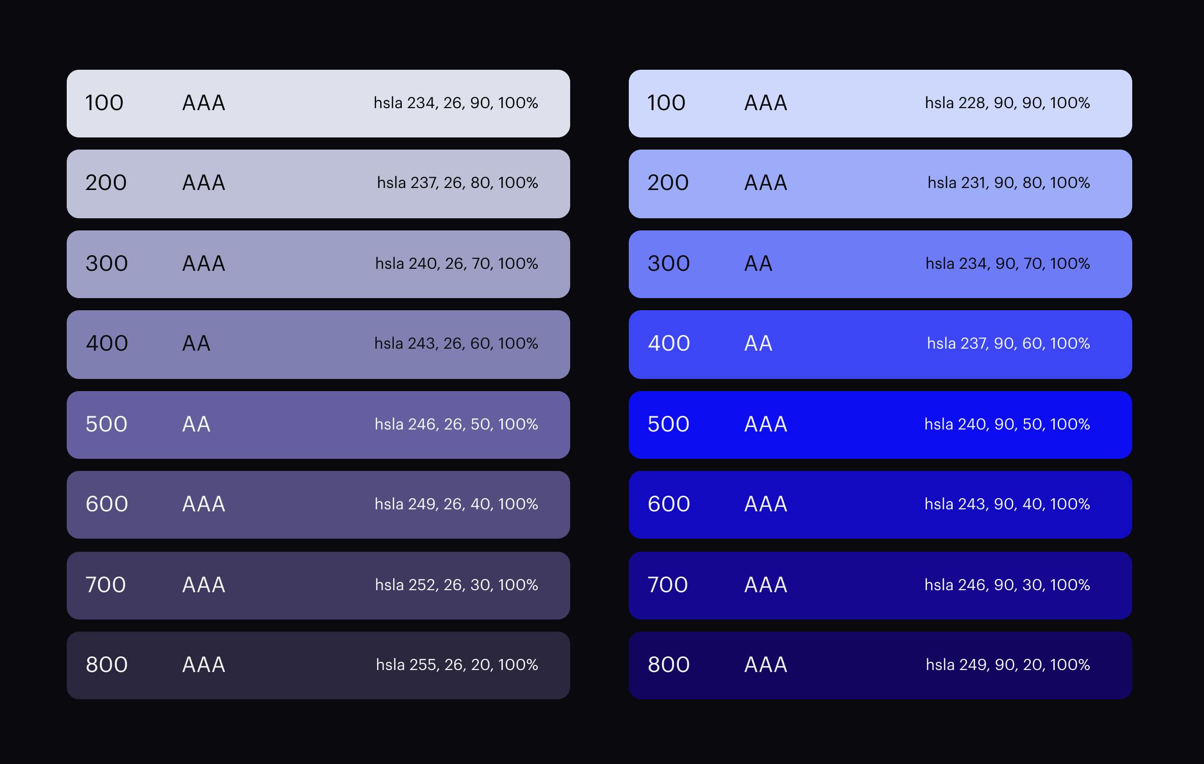
Determine the Number of Tones


The average number of tones for a single color in a flexible base palette is around 10 tones. For instance, Google utilizes a palette consisting of 13 tones.
Use the HSL Model
It is essential to utilize the HSL (hue, saturation, lightness) model alongside mathematical calculations when creating a base palette. The HSL model plays a crucial role in computing the numerical attributes of tones, ensuring alignment in terms of lightness. These calculations, in turn, eliminate the need for subjective selection of tones based on visual assessment and enable the direct calculation of tones at the front. The HSL model facilitates the management of all three components, although in practice, it is often sufficient to calculate just one parameter, which is lightness. In my work, I also make additional adjustments to the second parameter - Hue.
Lightness
Lightness plays a fundamental role in generating a variety of color tones. It can be represented using numerical values ranging from 0 to 1000, with 1000 denoting black and 0 denoting white. Employing a step size of 10, you can create 9 distinct tones, excluding pure white and black from this spectrum.


Numeric tone names offer a clear and straightforward way to assess any color by indicating its lightness level. For instance, names like "Blue 500" and "Gray 500" immediately signal that these colors share the same lightness parameter.
Tip
In practice, when creating a color palette, it is often necessary to incorporate intermediate values for both the lightest and darkest tones. Consider using intermediate tones, like 50 (with a lightness parameter of L 95) or 950 (with a lightness parameter of L -5). These tones introduce more subtle variations, thereby enriching your color scheme versatility and its visual appeal.
Tip
To enhance accessibility in your design, it's recommended to avoid utilizing pure black (hex code 000000) and pure white (hex code FFFFFF) in your color palette. Instead, consider utilizing tone values such as 50 and 25 for white texts when working with dark themes. This approach guarantees that texts remain easily readable and user-friendly, even in low-contrast settings.
Hue
Another less obvious tip is adjusting the Hue parameter when creating color tones. By doing so, you can achieve a well-balanced color palette that aligns with the way the human eye perceives colors. For instance, in lighter tones, a blue color may visually appear as purple, potentially causing perceptual distortions.

By calculating color tones using the HSL model, you streamline the process of developing custom themes for partners or users. This methodology allows you to apply a single formula to create a theme for any color, thereby ensuring consistency and simplifying the theme creation process.
Semantic Structure

While a broad base palette of tones offers flexibility, employing it for day-to-day design tasks can be challenging. To simplify this process, it's essential to implement a semantic structure or a grouping system that maps a color token to a specific color role. This structure is critical for several reasons:
Streamlined Description
This approach allows you to specify only the particular set of color tokens used in the existing interface, avoiding the need to include every color from the extensive base palette and thereby preventing design overload.
Promoting Clarity within Teams

Semantic structures make color names understandable to both designers and developers, promoting clarity and facilitating collaboration within large teams working on a single project.
Universal Template
The universal template can be easily customized to create various themes, such as light, dark, or custom themes.
Within design systems, color categorization often relies on a single criterion, such as the role of tone in the hierarchy (e.g., accent, primary, secondary). To enhance future theme flexibility, consider introducing additional supplementary criteria for effective grouping.
Essentially, the semantic structure should maintain consistency across different themes. This unified approach streamlines the operations with various themes, ensuring both stability and ease of use.


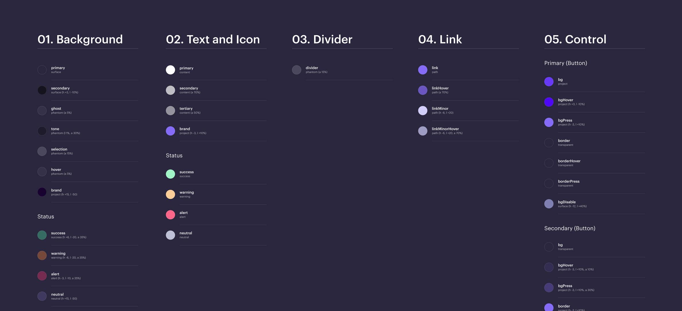
Group by Type of Interface Elements
Organizing colors based on the category of interface elements is essential for achieving a balance between simplicity and a minimal set of variables. This approach involves categorizing colors into various groups, including:
- Background
- Text and Icons
- Controls
- Dividers
- Links
These categories collectively cover a wide range of elements commonly found in interfaces. A well-structured naming and grouping system facilitates coordination within large teams and simplifies the onboarding of new team members.
When working with multiple variables, striking a balance to maintain design eloquence and consistency when developing themes can be challenging. An insufficient number of variables can impede the eloquence of the design system, while an excess of variables can jeopardize consistency.
This concept can be illustrated through a focus state: by describing it within a 'Controls' group once, you eliminate the necessity to describe it separately for each type of interface components.
Group Interface Elements by Type: Subgroups

When grouping interface elements by type, there's often a need to introduce additional subgroups to achieve a finer level of granularity, especially when handling control states.
Group Colors by Role
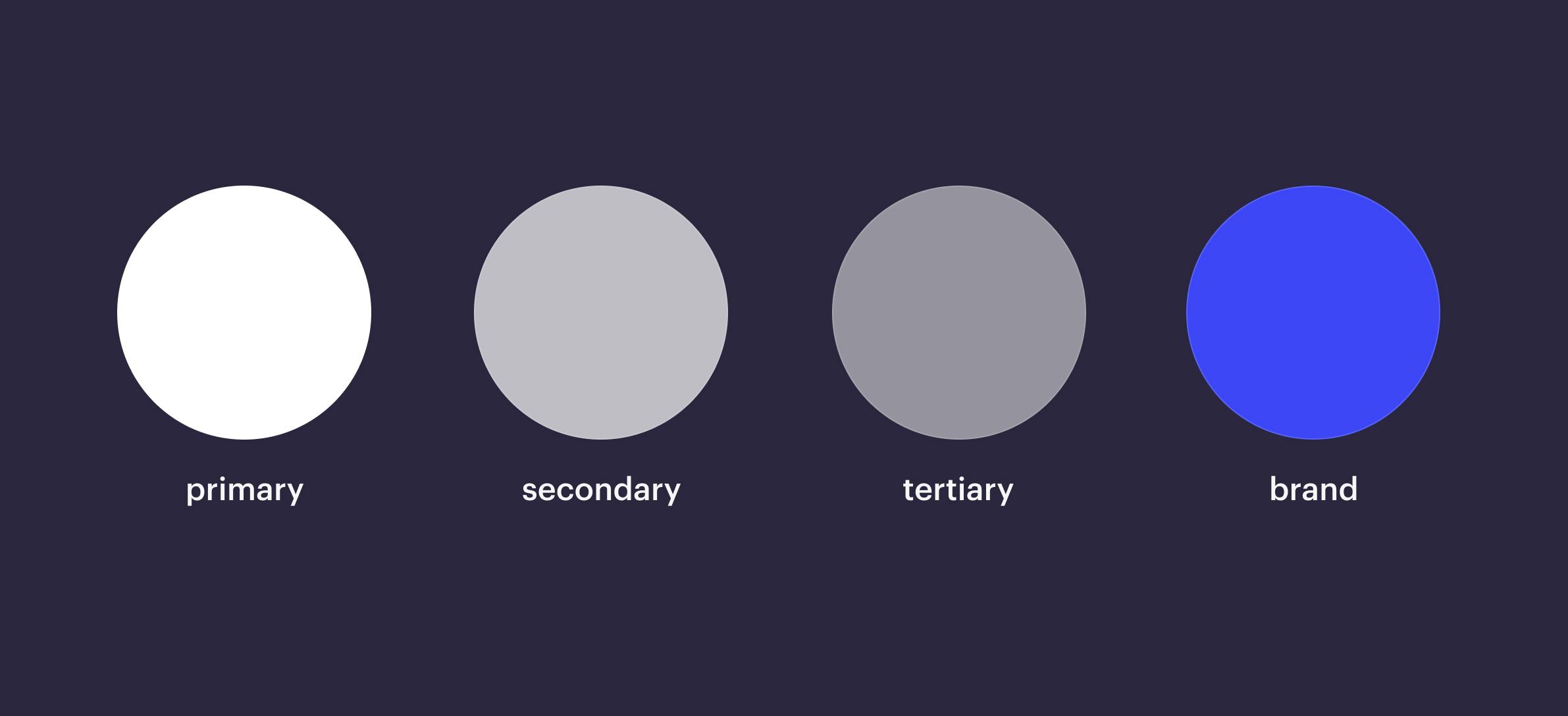
Grouping colors according to their roles is essential for understanding the significance of each color and establishing a hierarchy within your design system. This classification includes the following major groups:
- Primary Colors
- Secondary Colors
- Accent Colors
- Neutral Colors
For instance, accent colors typically serve branding purposes while secondary colors are utilized for supporting elements.
Additional Labeling
In addition to outlining the hierarchy of color roles, you may also need to assign labels to define various states. For instance, within controls, you should specify states such as "hover," "press," and "disabled." Similarly, you might incorporate additional labels for statuses, such as "success," "error," and "warning." Such labels provide clarity and guidance when working with colors within your design system.
Themes

Themes have gained increasing importance in recent times, especially with the adoption of both light and dark themes as industry standards. Interface developers face additional challenges when working with custom themes, as it requires a systematic approach. On top of that, it is important to recognize that dark themes aren't merely a direct inversion of light themes. For instance, dark themes might include light-colored input fields. Such cases highlight the necessity for a more nuanced approach to themes within the design system.
Summary
The universal semantic structure approach offers a robust framework for organizing and managing colors within interface design systems. This method has shown to be exceptionally effective, particularly in large-scale scenarios where your interface or design system is closely affiliated with a partner brand. It can also prove valuable when managing a diverse ecosystem of various products, preventing the entry of numerous smaller design systems. After all, a visual language can be distilled down to three fundamental elements - color, typography, and shape. By utilizing variables seamlessly integrated into a unified template, you can construct a theme suitable for any visual language.
