

Color is essential in user interface (UI) design; it influences emotions, perception, engagement, and retention. As a designer, understanding the principles of color psychology can help you create interfaces that resonate with users, improve usability, build loyalty, encourage continued interaction, and enhance the overall experience. In this article, we will explore how to use color psychology effectively in UI design with practical examples.
Understanding Color Psychology in UI Design
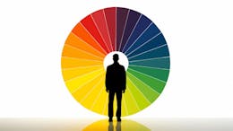
Color psychology studies how different colors affect human behavior, emotions, and decision-making. Different colors evoke different responses, so choosing the right palette is crucial based on your interface's goals. In User Interface Design, choosing the right colors for your product is as important as finding solutions to people’s problems.
-
Colors can increase engagement by making interfaces visually appealing. Check out Ling Cars and Tesla, for instance; which website would you feel more comfortable continuing to view?
-
Colors improve usability by guiding attention and actions; e.g., cancel buttons, usually in red, serve as a warning system for users so they can think carefully before making a decision.
-
Colors can enhance brand perception by reinforcing identity. At the top of my head, I can associate green and white with Starbucks, red and yellow with McDonald’s, red and white with Coca-Cola, etc. That's the power of color.
-
Colors can boost conversions by strategically using contrast and CTAs. How you contrast your designs or the colors you use for your call-to-action buttons would require specific actions from your users, leading to increased engagement.
The Emotional Impact of Common Colors
Colors have a huge emotional impact on people, which is why designers and brands often select colors based on the type of products they are creating. For example, if you are designing games for children, you will likely want to opt for fun and playful colors. Let’s take a look at some colors below and their psychological effect:
White Color
Psychological Effect: Cleanliness, clarity, minimalism
Use Cases: Tech, healthcare, modern interfaces
Black Color
Psychological Effect: Sophistication, authority, elegance
Use Cases: Luxury brands, minimalist designs
Purple Color
Psychological Effect: Luxury, creativity, mysticism
Use Cases: Beauty, high-end products
Orange Color
Psychological Effect: Eagerness, creativity
Use Cases: Entertainment, food, and subscriptions
Yellow Color
Psychological Effect: Positiveness, warmth, caution
Use Cases: Discounts, warnings (used sparingly)
Green Color
Psychological Effect: Growth, health and fitness, success
Use Cases: Eco-friendly brands, finance (positive actions)
Blue Color
Psychological Effect: Trust, calm, peaceful, professionalism
Use Cases: Finance, healthcare, social media
Red Color
Psychological Effect: Energy, urgency, desire
Use Cases: CTAs, alerts, sales
Pink Color
Psychological Effect: Playfulness, warmth, love, femininity
Use Cases: Dating apps, beauty brands
Brown Color
Psychological Effect: Stability, earthiness, reliability, warmth
Use Cases: Organic or natural brands, vintage and retro designs
Gray Color
Psychological Effect: Neutrality, professionalism, sophistication (but can feel cold or dull if not balanced)
Use Cases: Corporate websites, minimalist designs, secondary text/UI elements
Purple Color
Psychological Effect: Luxury, creativity, spirituality, mystery, playfulness
Use Cases: Beauty and luxury brands, creative platforms, wellness apps
This applies to the millions of colors we have in the world. Each one has its use cases and the psychological effect it has on humans.
Applying Color Psychology in UI Design for Engagement
How users interact with your product and how effectively your product captures their attention are highly dependent on your choice of colors. There are other factors, too, like the pattern of design, elements used, user experience, and even microcopies, but it all begins with your choice of colors.
Let’s dig deeper into some ways you can leverage the use of color for engagement:
- Establishing Brand Identity and Emotional Connection: A company's logo and color palette should reflect its brand values and target audience. For example,
-
A financial institution might use blue to convey trust and stability.
-
A children's app might use bright, playful colors like yellow and orange.
-
A health and wellness app could use shades of green to promote feelings of calm and well-being, reinforcing its focus on natural remedies and relaxation.
-
- Creating Effective Calls to Action (CTAs): CTA buttons should stand out and prompt users to take action. Using contrasting colors helps attract attention and guide user flow. Colors like red and orange are often used for CTAs to create a sense of urgency and encourage immediate action. For example,
-
A "Buy Now" button in an e-commerce interface uses a vibrant orange color to draw the user's attention and drive sales.
-
A subtle green might be used for a less aggressive, more positive CTA, such as "Start Free Trial."
-
- Improve Readability & Accessibility: Using high contrast between text and background will ensure readability and accessibility on your websites or apps.
-
Using black text on a white background is ideal for readability.
-
Avoid low-contrast combinations like light grey text on a white background. It will be almost unreadable.
-
Avoid color overload. Using too many bright colors can overwhelm users.
-
- Highlighting Key Information: Color can be used to create visual hierarchy and guide users through the interface. Brighter, more saturated colors can be used to highlight important elements, while muted colors can be used for less important elements. For instance, colors are used to highlight important elements in design like notifications, messages, etc.
-
Yellow color for warnings, e.g, Unsaved Changes
-
Red color for error messages, e.g, Invalid Password
-
Green for success messages, e.g, Payment Successful
-
- Enhancing User Experience and Usability: Colors can be used to create a consistent and intuitive user experience for users. For example, using a specific color to indicate active elements or clickable links.
-
Use blue for all clickable links within a text-heavy application.
-
Green pop-up messages show that a process has been successful, and red shows a failure.
-
- Personalization and Customization: Allowing your users to customize the color scheme of the interface can enhance their sense of control and ownership, which will lead to increased engagement.
- A platform that allows users to choose a theme and color scheme for their profile will present them with an opportunity to try out other themes and see how they would work on the main platform, thereby boosting engagement.
Driving Retention Through Color Psychology
Retention focuses on keeping users engaged over time by creating an intuitive and visually appealing experience, and color plays a very important role in this. Here’s how color can help:
- Consistent Branding: A consistent use of color schemes helps reinforce brand identity and make UI design recognizable. For example, Facebook’s use of blue builds trust and recognition. Netflix’s red accent color creates urgency and excitement.
- Emotional Connection with Users: Choosing colors that align with user emotions helps build a connection and improves retention. For example: Calm blues and greens for meditation apps Energetic pink and yellows for children’s apps
- Dark Mode for User Comfort: Dark mode reduces eye strain, making it popular for apps used at night or for extended periods. For example, Twitter, YouTube, Instagram, and Gmail provide dark mode options for better user experience.
- Creating a Sense of Comfort and Familiarity: The consistent use of colors throughout the interface of a product can create a sense of familiarity and comfort, encouraging users to keep returning. For example, a streaming service maintaining a consistent color scheme across all platforms (web, mobile, TV) will encourage users to use that product regardless of what platform they are on because of familiarity with the User Experience and Interface. They are already used to that design, interface, user experience, and colors. Wouldn’t it be weird to log in to Netflix on your mobile app and see a different color and logo when the website has a different branding?
- Providing Visual Feedback and Reinforcement: Colors can be used to provide visual feedback and reinforcement, such as highlighting completed tasks or successful actions. This positive reinforcement encourages continued use. For example, A task management app highlights completed tasks in green, giving the user a visual sense of accomplishment and encouragement to do more.
Common Mistakes to Avoid
-
Ignoring cultural differences. Color meanings can vary across cultures. When selecting colors, it is important to consider the target audience's cultural background. For example, white symbolizes purity in the West but mourning in some Asian cultures. Black is primarily used for mourning in most African countries.
-
Overusing bright colors leads to visual fatigue. As a user, I just want to be able to browse through a catalog and select a product that I want, add it to my cart, buy it, and go my way. Seeing each product card have different colors is just so tiring cause, at this point, I do not know what I am looking at again.
- Poor contrast, making text hard to read. White text has no business being on a bright yellow background. That will make it difficult for users to read.
-
No Accessibility Consideration. Always ensure that color choices meet accessibility guidelines, particularly for users with visual impairments. Consider color contrast and provide alternative visual cues.
-
Inconsistent color schemes confuse users. Let your product be known for one or two primary colors. Then, you can create complementary colors to support other use cases across the platform.
As a User Interface Designer, by thoughtfully applying color psychology to your designs, you can create interfaces that are not only visually appealing but also emotionally engaging and effective in driving user engagement and retention.
Conclusion
Color psychology is a subtle yet powerful way to enhance engagement and retention in UI design. Understanding color associations, effectively using contrast, and maintaining consistency are key factors in creating user-friendly, visually appealing, high-performing interfaces. By applying these principles, Designers can create interfaces that not only look appealing but also drive desired user actions.