


How to Build Fully Responsive React Apps with Nothing but Inline Styles and JavaScript
A tutorial for devs sick of chaotic stylesheets and media queries.
What you’ll build
App 👉 https://ryanjyost.github.io/react-responsive-tutorial
Repo 👉 https://github.com/ryanjyost/react-responsive-tutorial
Why I wrote this
I love using inline styles in React. Almost as much as I dread dealing with media queries and traditional stylesheets to make my projects responsive.
Do I even need media queries or Bootstrap?
I asked myself that question before starting to build my second personal site. For a handful of one-off situations, I’d used JavaScript to calculate a transform, color, etc. with great effect. Why couldn’t I take that strategy to the extreme and use JavaScript to handle all of my styling. (Ok, maybe not all…CSS is still the easiest way for hovered styling IMO and other common use cases.)
👉 Here’s the site I built without media queries
Mess around with your browser window size. All of the changes that take place at different screen sizes are driven entirely by JavaScript, with help from React’s fast re-rendering. If you find a bug, please let me know in the comments or via email, thanks!
Some of my takeaways were…
- The developer experience was incredible compared to the old way.
- I built it super quickly, with way fewer hiccups and roadblocks along the way.
- JavaScript and inline styles in React 🙌 vs. CSS stylesheets and media queries 😖
- I felt like I was using a scalpel vs. the bone-saw of media queries and/or Bootstrap.
By the way…
While I found very few issues with this paradigm, I’m definitely a little bit unsure/concerned about scalability, support on older browsers, performance, etc. Not yet convinced it’s a perfect alternative, and expect to find shortcomings/issues the deeper I go. But I’m hopeful about using this paradigm going forward.
Getting started
Create a new React app with create-react-app.
sudo npx create-react-app react-responsive-tutorial
Not sure when this started, but with create-react-app I’ve had to use sudo and chown the project directory after creation. So if you get any “EACCESS” issues, don’t be surprised.
If you have editing/EACCESS issues, chown the project directory (like the below snippet for a max/linux)
sudo chown -R $USER <path to>/react-responsive-tutorial
Enter the project and start it up.
cd react-responsive-tutorial
npm start
Initial Building Blocks
Let’s take a mobile-first design approach and set up the basic structure of our app that’s optimized for small screen sizes.
Open up your App.js and paste the following code into it.
<a href="https://medium.com/media/1cd811ea919c26e02fd869cbe4ffacec/href">https://medium.com/media/1cd811ea919c26e02fd869cbe4ffacec/href</a>
Some things to note from the above snippet
- We created a styles object that will contain the main styling properties for our app.
- In this tutorial, we’ll just pass the styles as props to keep things easy. A better way could be to write a higher order component (HOC) or keep track of styles in a Redux store. If you want me to write a tutorial or create an npm package for a more sophisticated version of handling React app styling with only JavaScript and inline styles, please leave a comment!
- We have an array of menuItems that will be displayed in the FooterMenu. Why keep them in App.js? Because we’ll use the same array in the sidebar at larger screen sizes!
- I just recently started using functions (e.g. (opacity = 1) => `rgba(255, 255, 255, ${opacity})`) to manage my app’s main colors and their opacities, simply because I got super frustrated copying and pasting or memorizing them with inline styles. Sure I could take advantage of something like SCSS of Less, but it’s been a great help with the JavaScript + inline styles approach.
Let’s create components for the small screen layout
Create a new folder in the src directory called components and add the three main layout components in there.
Topbar.js
<a href="https://medium.com/media/8d21af453ea229ebb6295fd0026d50d4/href">https://medium.com/media/8d21af453ea229ebb6295fd0026d50d4/href</a>
- Note how we’re using the globally available styles.topBarHeight for (you guessed it) the height of the Topbar. Seems trivial here, but it’ll help to use the same property in the Content.
FooterMenu.js
<a href="https://medium.com/media/bf95ba7096ed408536766c1068ed2ff9/href">https://medium.com/media/bf95ba7096ed408536766c1068ed2ff9/href</a>
- Here we’re just rendering the menuItems to be evenly spaced and centered in the fixed footer. Note that it’s just icons for now — we’ll add words at a bigger screen width shortly.
Content.js
<a href="https://medium.com/media/e491e16b8ac3bf2cb1c4b794f95a31fd/href">https://medium.com/media/e491e16b8ac3bf2cb1c4b794f95a31fd/href</a>
- We’re creating 20 dummy blog posts to act as the content.
- Because the TopBar and FooterMenu have fixed positions, they overlap the Content. So, taking advantage of our globally available styles, we can set top and bottom padding of the Content based on the topBarHeight and footerMenuHeight. And If you ever want to change those values, the Content will update accordingly and not have any styling issues.
- Refresh if you see errors, hot loading might not notice new files.
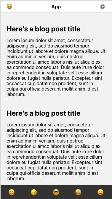
Here’s how it should look on a mobile sized screen

But when it gets bigger….


Yeah, not ideal. So, when the screen is wide enough (at 500px, for example), let’s show the text of the menu items in the <FooterMenu/>. But how do we know when the screen is 500px wide, without using media queries?
Tracking the window size and using it
Here’s some updated code to paste into App.js.
<a href="https://medium.com/media/7551bb7553ae2587cf73109cbd14445d/href">https://medium.com/media/7551bb7553ae2587cf73109cbd14445d/href</a>
- All we’re doing here is keeping track of the browser window’s width and height in the App component’s state.
- We don’t even need the height for this tutorial, but one can imagine use-cases for tracking it.
Again in App.js, add a bool property to the styles object indicating whether the window is wide enough to show text in the <FooterMenu/> menu items.
<a href="https://medium.com/media/137880d947a2a9b3f98550bafa621e3f/href">https://medium.com/media/137880d947a2a9b3f98550bafa621e3f/href</a>
Now update FooterMenu.js to show the menu text when applicable (and add some margin to the icons, too).
<a href="https://medium.com/media/b846aaf09baf017fd4cd94380ab90312/href">https://medium.com/media/b846aaf09baf017fd4cd94380ab90312/href</a>
Adding a sidebar for bigger screens
Our sidebar is going to have two versions
- A “collapsed” version that’s pretty thin and just has icons, which looks better on screen sizes too wide for a FooterMenu but not quite wide enough for a full blown sidebar with text.
- An expanded version that includes menu text and is for larger screen sizes.
So, let’s update the styles and tweak the render function in App.js to accommodate and control the new Sidebar component. Here’s the final App.js.
<a href="https://medium.com/media/3ce2b08af112738aa8eb8cce7f3468b8/href">https://medium.com/media/3ce2b08af112738aa8eb8cce7f3468b8/href</a>
Here are the notable changes in App.js above…
- styles.showSidebar — show the Sidebar when the window width is greater than 768px. We’ll also hide the FooterMenu and TopBar.
- styles.sidebarCollapsed — we’ll display the narrower, collapsed version of the sidebar at window widths less than 1100px.
- styles.sideBarWidth — change the Sidebar‘s width based on whether it’s collapsed or not.
Create a new component file called Sidebar.js, and paste the below code into it. Note all of the styling ternaries for handling the different styles at different screen sizes.
<a href="https://medium.com/media/cc7506d10ed47690afbec36bbf6a1a67/href">https://medium.com/media/cc7506d10ed47690afbec36bbf6a1a67/href</a>
One last thing…
The Sidebar is overlapping the main Content, so we have to make some final tweaks to Content.js to offset the content by however wide the Sidebar currently is, plus a little extra padding.
<a href="https://medium.com/media/7b3d3036afaf1971e22f8323a9d6d4d3/href">https://medium.com/media/7b3d3036afaf1971e22f8323a9d6d4d3/href</a>
And that’s it!
Play around with your browser window and see how responsive the app is.
